How do you give a new construction company an established and credible presence from the beginning?
Russell Contracts needed to stand independently from Detail Architecture while reflecting the same commitment to quality, organisation and attention to detail.
The identity also needed to work across very different environments:
• Construction sites
• Site hoardings
• PPE and workwear
• Vehicle livery
• Project documentation
• Client presentations
• Stationery and digital communications
This could not be an identity that only worked on a business card.It needed to perform wherever the business appeared.



Construction is the process of bringing individual elements together with precision. People, materials, planning and expertise must all work as one to create a successful outcome. That principle became the foundation of the identity.
Rather than showing a finished building, the brand would represent the process of building:
separate components coming together to form something clear, structured and complete.
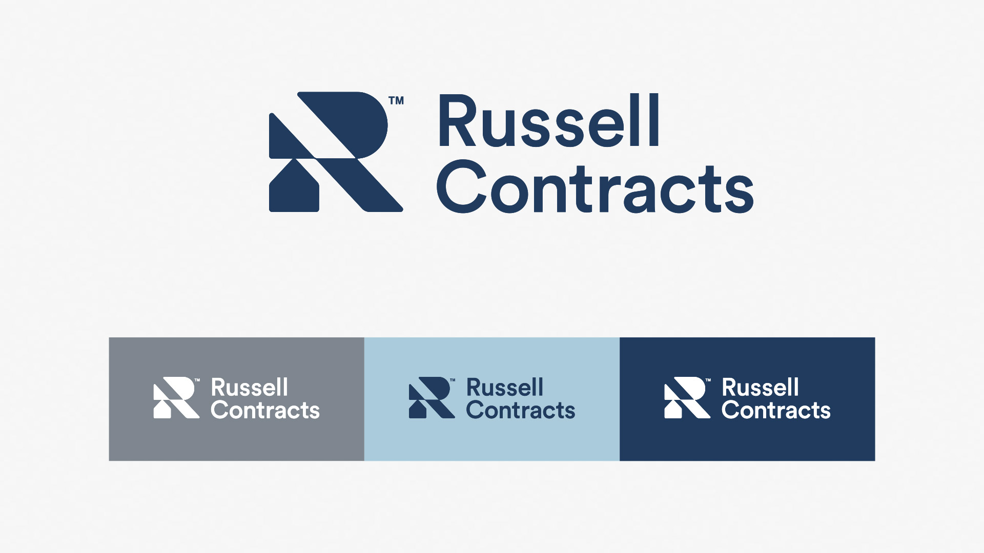
The Russell Contracts symbol is formed from a series of modular geometric shapes that combine to create the letter “R”.
Each component has its own role, but the identity only becomes complete when those elements work together.
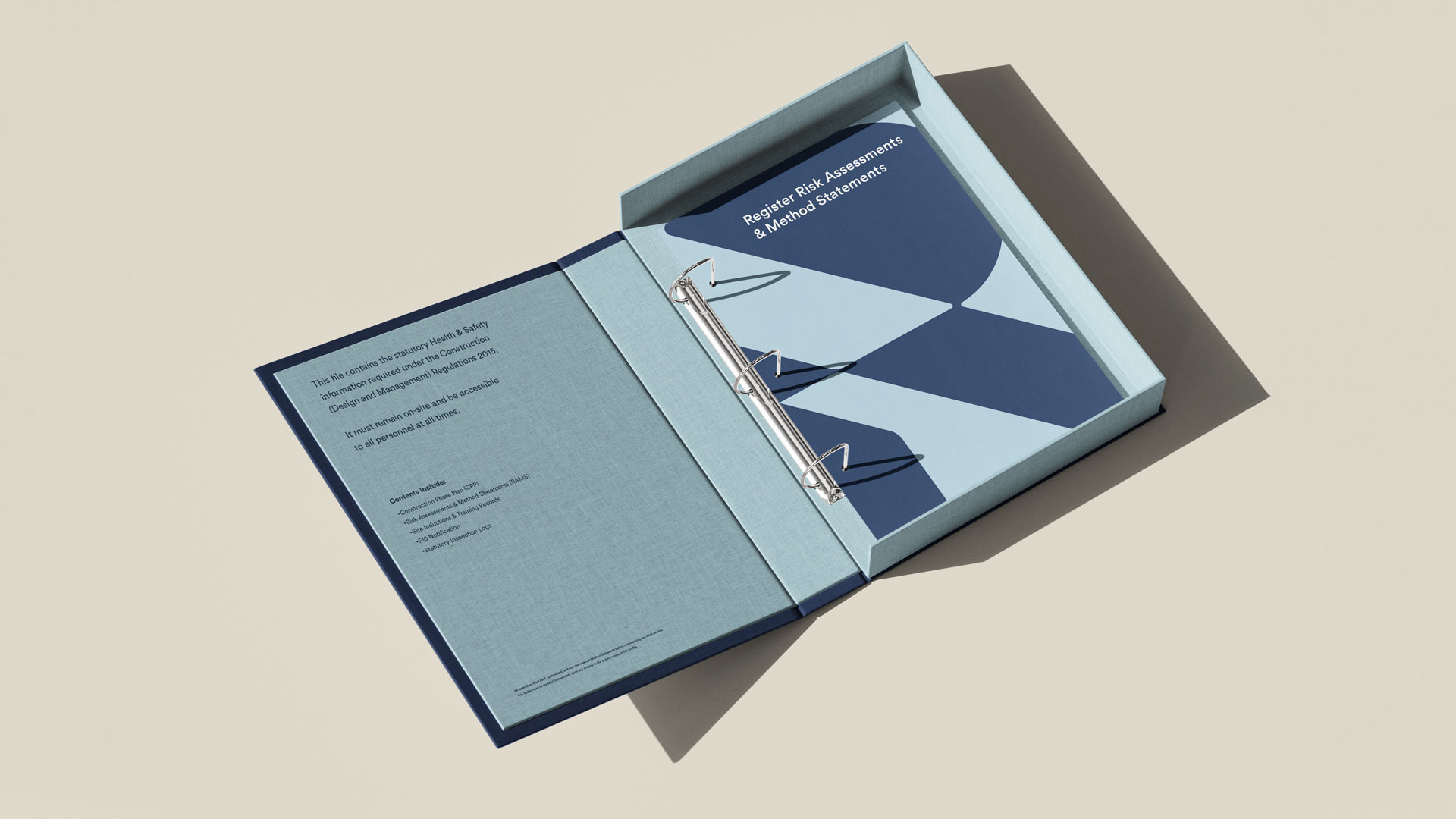
The angular forms and negative spaces also create a flexible graphic device. Construction photography can be framed, divided and revealed through the structure of the mark, allowing the identity to remain recognisable even when the complete logo is not shown.
This gave Russell Contracts more than a logo.
It created a visual system rooted in the way the business works.
Two strategically valid creative routes emerged during the identity process.
This was unusual.
Soul would not normally present a collection of unrelated ideas and ask a client to choose their favourite. Brand development should be a strategic decision, not a pick-and-mix exercise.
Both directions answered the brief, but the building-block concept offered the strongest opportunity.
It was:
• More distinctive
• More ownable
• Less literal
• More adaptable
• Better equipped to create a complete visual system
• Stronger as a platform for long-term brand recognition
The final decision was based on which identity could work hardest for the business, not simply which one looked most appealing in isolation.
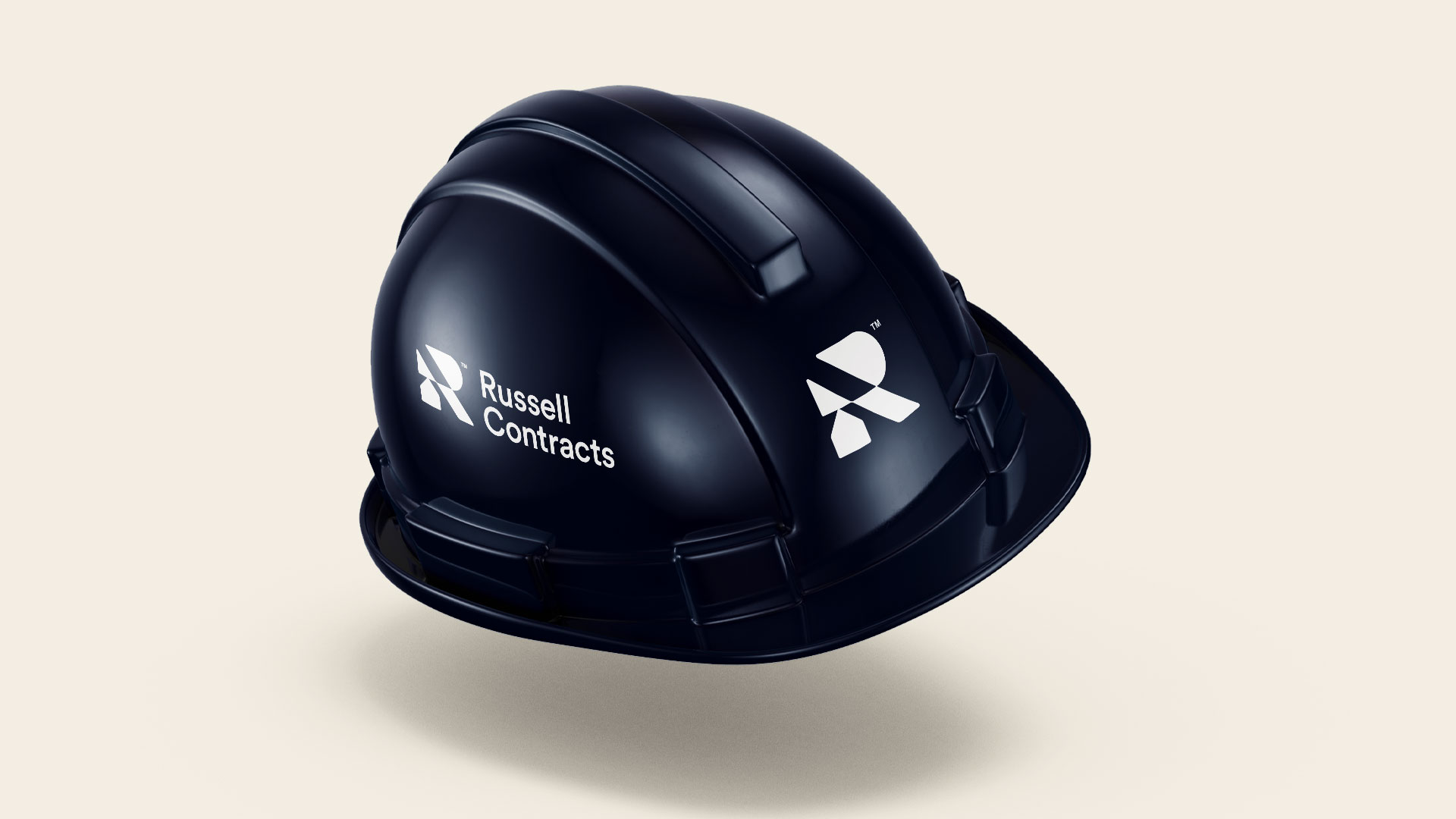
The colour palette reinforces the thinking behind the identity.
Constructor Blue provides confidence, stability and authority.
Roofline Blue introduces openness and contrast.
Foundation Grey creates a strong, practical neutral.
Together, these colours allow the identity to move between corporate, architectural and on-site environments while remaining recognisable.
The mark can appear in full, work independently as a symbol or expand into a graphic structure for photography and communications.
This flexibility allows the brand to feel consistent without making every application look identical.

Many construction identities rely on familiar visual shortcuts, rooflines, buildings, tools or generic structural shapes.
Russell Contracts takes a different approach.
The identity does not simply illustrate construction. It uses the logic of construction.
Its modular forms communicate assembly, coordination and progress.
Its graphic structure creates a distinctive visual language. Its simplicity gives it the clarity required in demanding site environments.
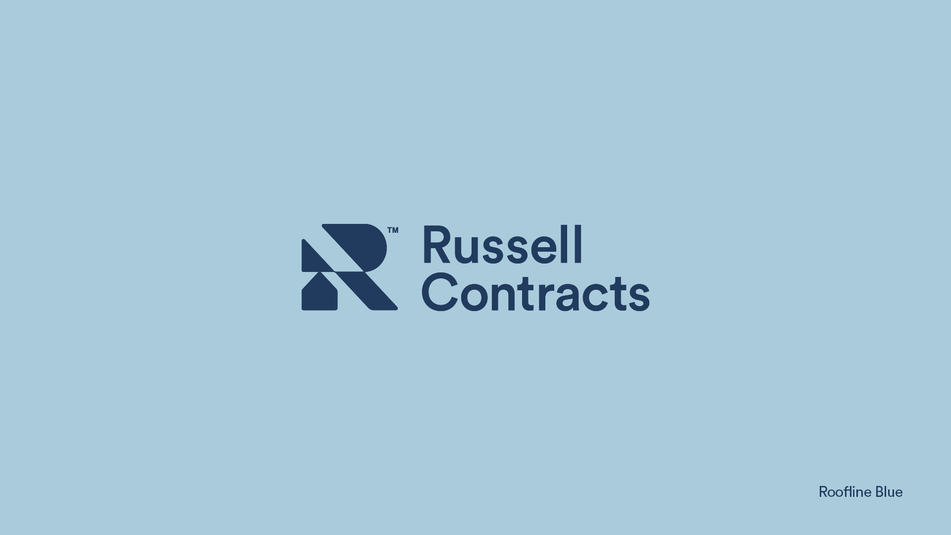
Whether applied to a large hoarding, a high-visibility jacket, a hard hat or a presentation folder, the brand remains clear and recognisable.
The completed identity gives Russell Contracts a confident and professional platform from which to grow.
It creates a consistent presence across construction sites, client communications and business materials, allowing a new company to present itself with clarity and credibility from the outset.
The business now has:
• A distinctive and ownable construction identity
• A clear relationship with Detail Architecture
• Strong visibility across physical applications
• A practical system for future communications
• A message focused on the outcome of its work
• A brand designed to grow with the company
The identity works because the idea and the execution are inseparable. The symbol reflects the construction process.
The graphic system is built from the symbol. The colour palette supports the environments in which the business operates. The campaign line connects construction with the lives and spaces it helps create.
Everything follows the same underlying principle:
• Strong foundations.
• Individual elements working together.
• Clear and considered execution.
Credibility comes from more than a professional logo. A clear identity, consistent messaging and considered application across site materials, vehicles, workwear and client communications all help demonstrate organisation, reliability and attention to detail.
No. Literal buildings and rooflines may communicate the sector quickly, but they can also make construction companies look interchangeable. A more strategic identity can represent how the business works, creating stronger distinction and long-term recognition.
The relationship should begin with shared values rather than identical visuals. Russell Contracts reflects the quality and attention to detail associated with Detail Architecture while using its own name, identity and visual system to establish an independent market position.