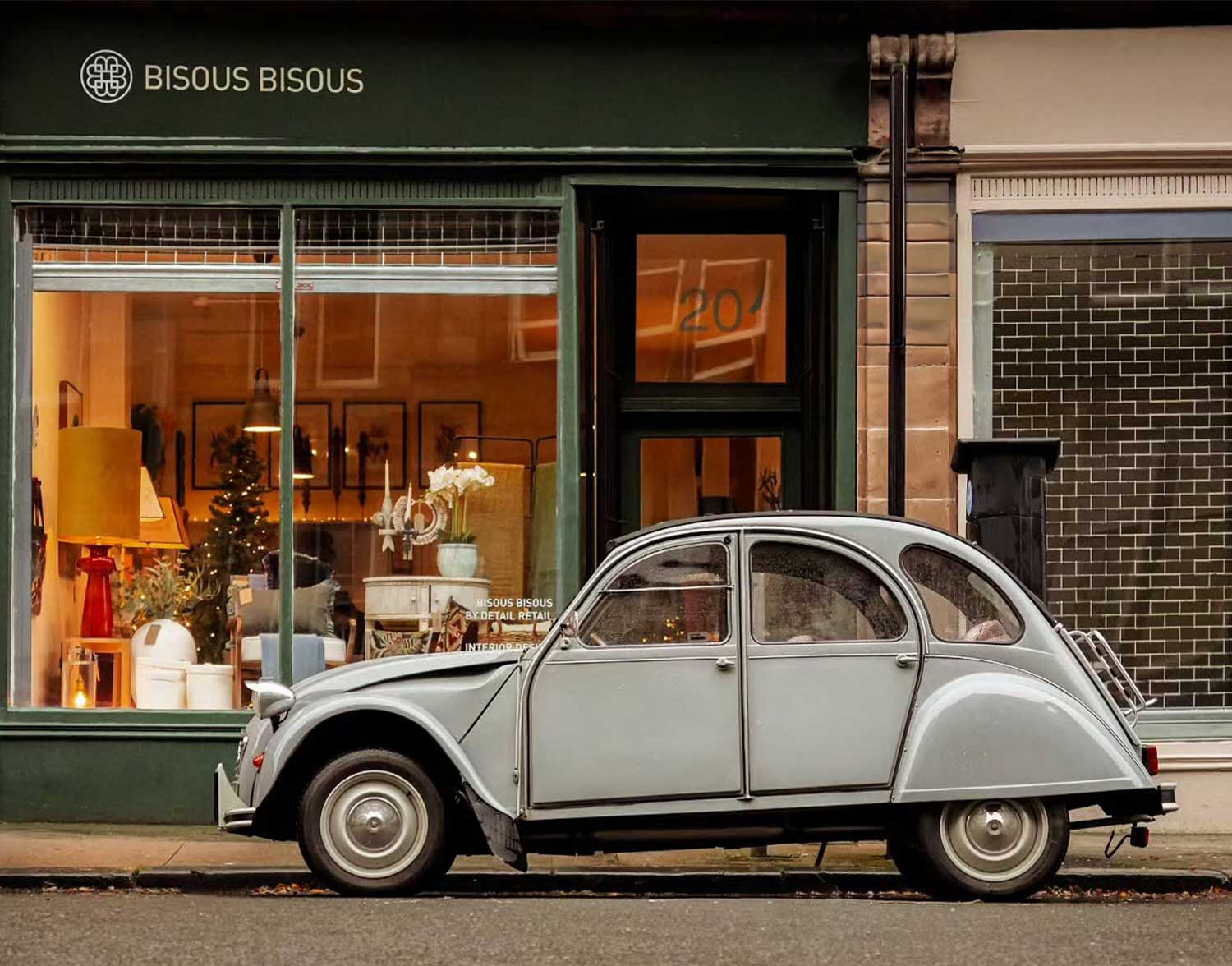
How do you develop an existing retail identity without losing the qualities that already make it distinctive?
Bisous Bisous brings together objects from different periods, makers and places. Each piece has its own material character and story. The brand therefore needed to create a recognisable frame around a varied collection without becoming louder than the products it represented.
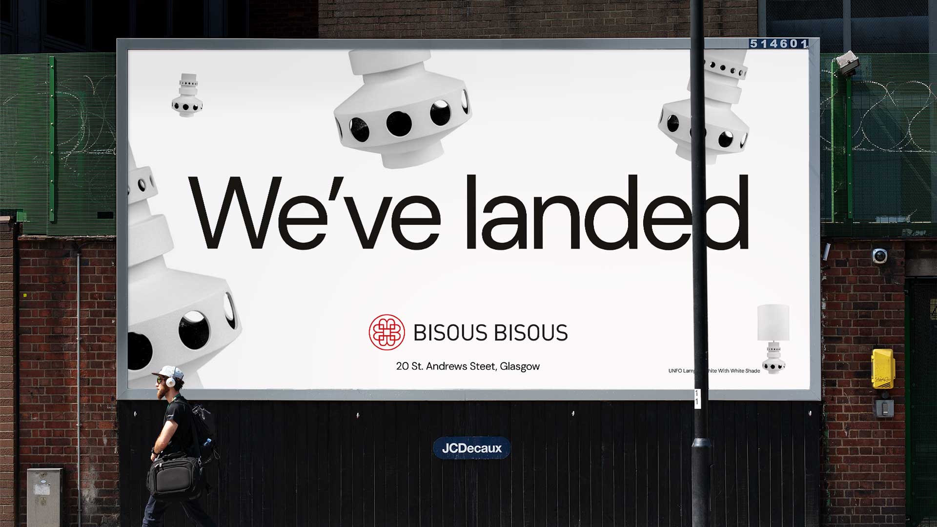
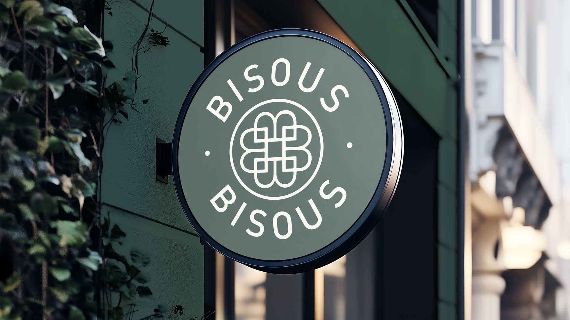

The system was designed to remain recognisable whether Bisous Bisous appeared at billboard scale, on a shop signor on the smallest product label.
This included:
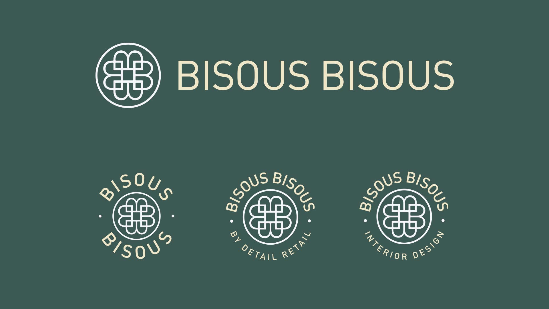
• A developed logo suite, including horizontal, circular and endorsed variations
• A flexible colour system using forest green, red, black and warm neutral formats
• Clear typography and brand hierarchy
• Shop front and projecting-sign applications
• Outdoor and product-led advertising concepts
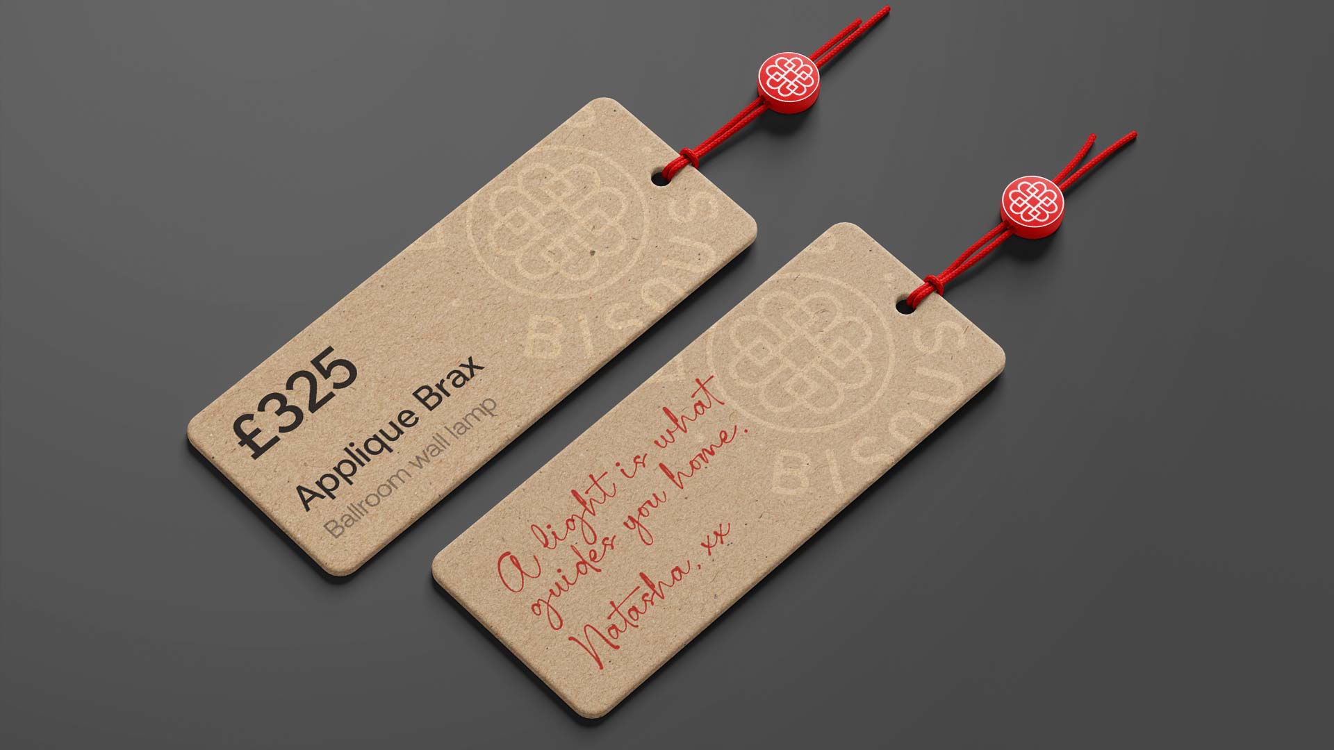
• Branded product tags and pricing tickets
• Carrier bag and merchandise applications
• Packaging tape, shipping boxes, labels and mailing formats
• A consistent visual framework for future retail communications
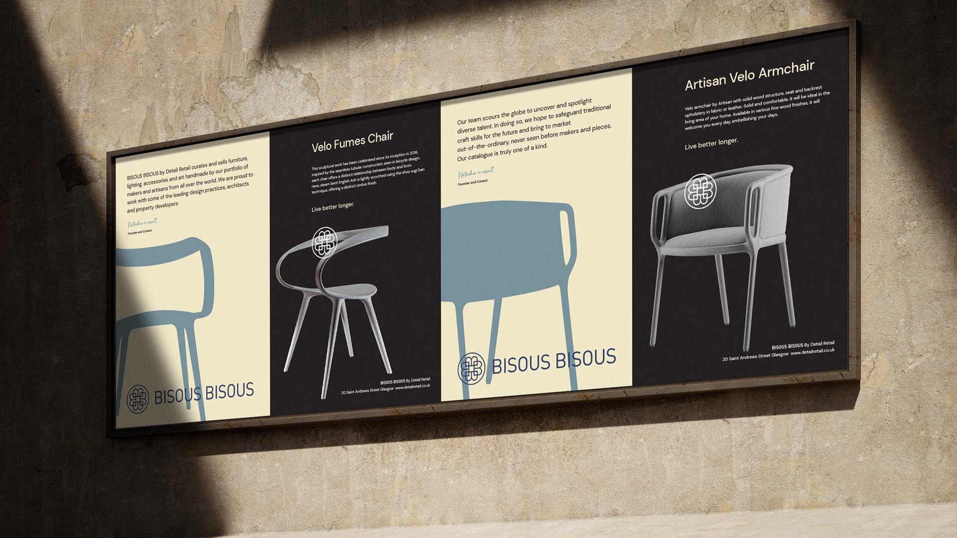
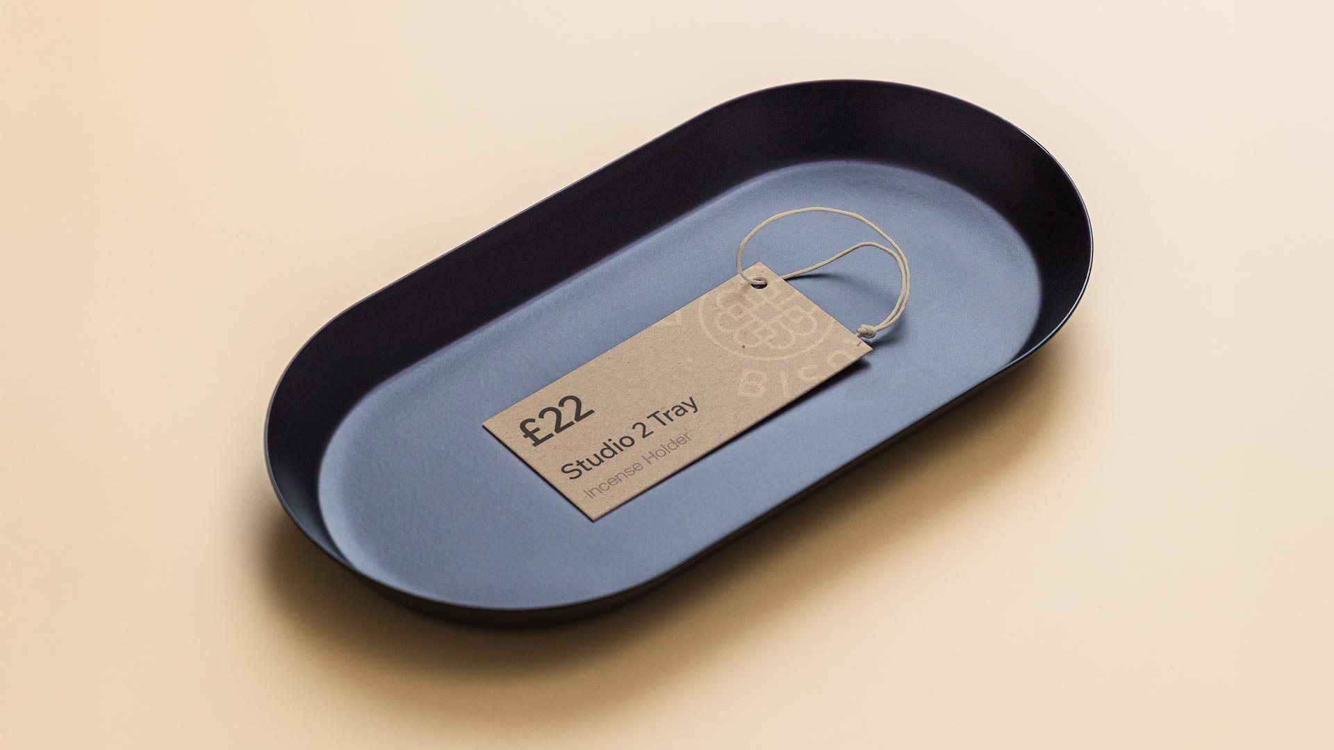
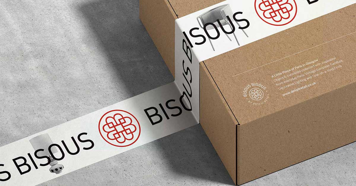

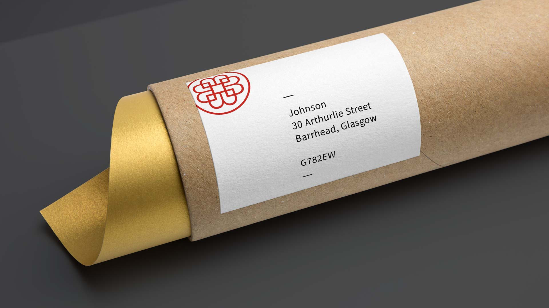
The brand did not need to become busier to become more effective.
By clarifying how the identity should flex, Bisous Bisous gained a more coherent presence without losing its original charm. The collection could continue to change and evolve while the visual system provided continuity around it.
The result feels curated rather than controlled:
• Recognisable
• Tactile
• Unmistakably personal
Bisous Bisous now has a retail identity designed to work as confidently as the collection it represents. The final brand aligns closely with the quality of Detail Architecture’s work.
The expanded system creates consistency across physical, promotional and packaging touchpoints, giving the boutique a clearer presence in Glasgow and a practical foundation for future growth.
Most importantly, the branding knows when to speak and when to step back - allowing the furniture, vintage finds, sculptures and objects to remain at the heart of the experience.
The work succeeded because it began with what was already valuable. We did not replace a distinctive identity for the sake of visible change. We listened, identified where structure was missing and developed a system around the existing mark that was flexible enough for retail, disciplined enough for consistency and restrained enough to let the collection lead.
Final Word
Good brand development is not always about reinvention. Sometimes it is about recognising the character that is already there - and giving it the clarity to work harder.
No. If the existing identity is recognisable and appropriate, the better approach may be to develop a clearer system around it. This protects existing brand equity while improving consistency, flexibility and real-world use.
Consistency comes from defining how the logo, typography, colours and supporting graphics adapt across different formats. Clear rules create a recognisable customer experience without forcing every application to look identical.
A useful retail brand system can include logo variations, typography, colour formats, signage, packaging, product labels, merchandise and advertising templates. The exact scope should reflect how customers discover, experience and take the brand home with them.