


Most maternity education brands look the same. They even talk like each other.
- Professional.
- Expert-led.
- Trusted.
But none of that builds connection. Because learners in this space aren’t driven by credentials. They’re driven by care.
They want to feel:
• Confident.
• Capable.
• Ready for real situations.
Without a clear identity, NestBaby risked becoming another platform — instead of something people trust.
The problem wasn’t the offering.
It was the perspective.
Most competitors talk about themselves.
Their expertise. Their courses. Their authority.
NestBaby needed to reverse that:
From company-first → learner-first
From information → understanding
From theory → real-world care
Everything started with positioning.
A single idea that aligned the entire brand:
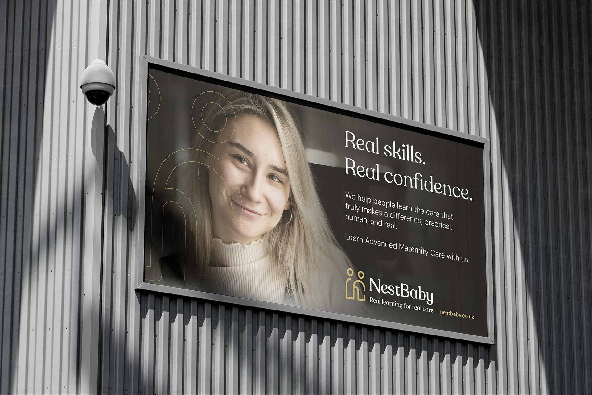
Real learning for real care
- Simple.
- Human.
- True.
It works because it does two things at once:
• “Real learning” → practical, usable, grounded
• “Real care” → emotional, human, meaningful
This became the anchor for every decision.
This project wasn’t branding, then website, then product.
It was one connected system.
Every layer had to align:
• Positioning
• Tone of voice
• Identity
• Website
• Learning experience
Because inconsistency breaks trust — especially in a space built on care.


A clear shift:
Build a learner-first experience
Not just in messaging — in how people actually learn.
That meant:
• Speaking to the learner, not about the brand
• Removing jargon and complexity
• Designing for real-life situations
The experience had to support a journey:
Curiosity → enrolment → learning → confidence
A complete, connected brand and learning system:
Positioning
A clear, human statement that differentiates from corporate language
Tone of voice
“Talk like friends” — warm, direct, supportive
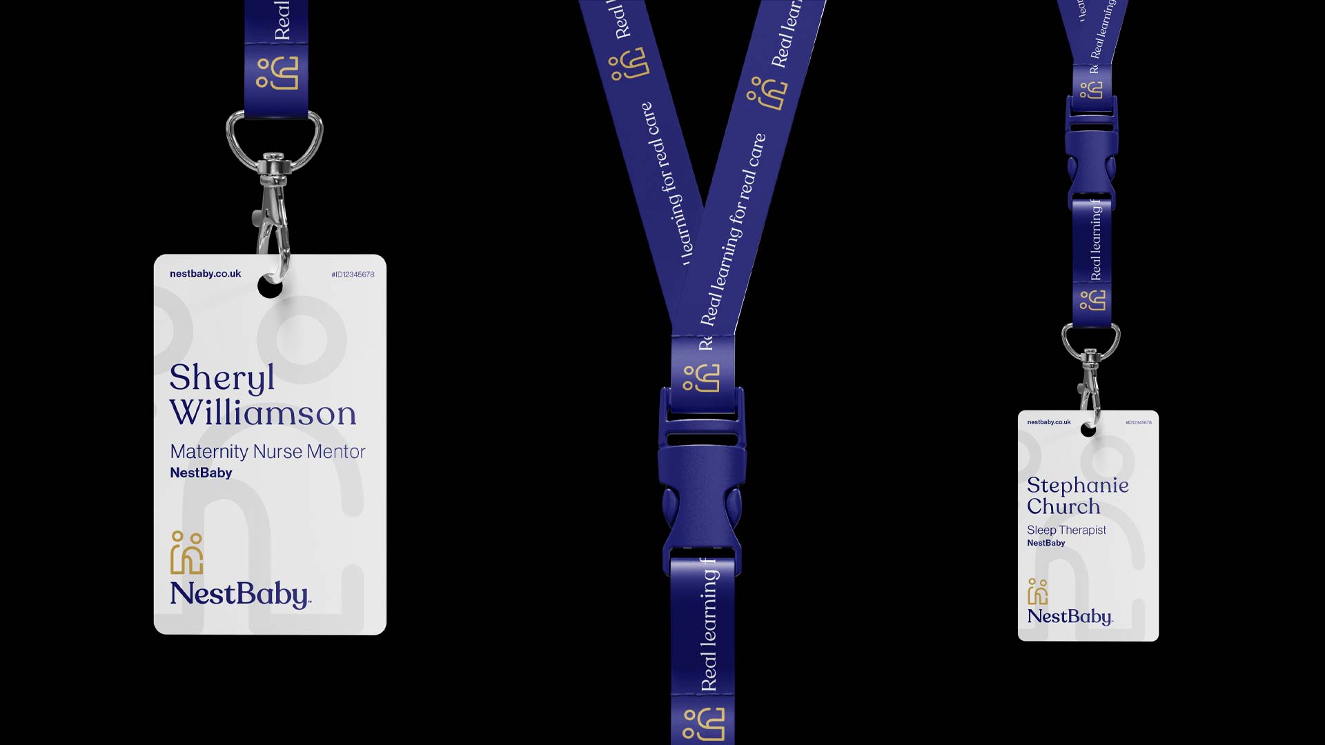
Identity system
A visual language built around connection — teacher and learner coming together as one symbol
Website experience
Designed around clarity, simplicity, and emotional connection
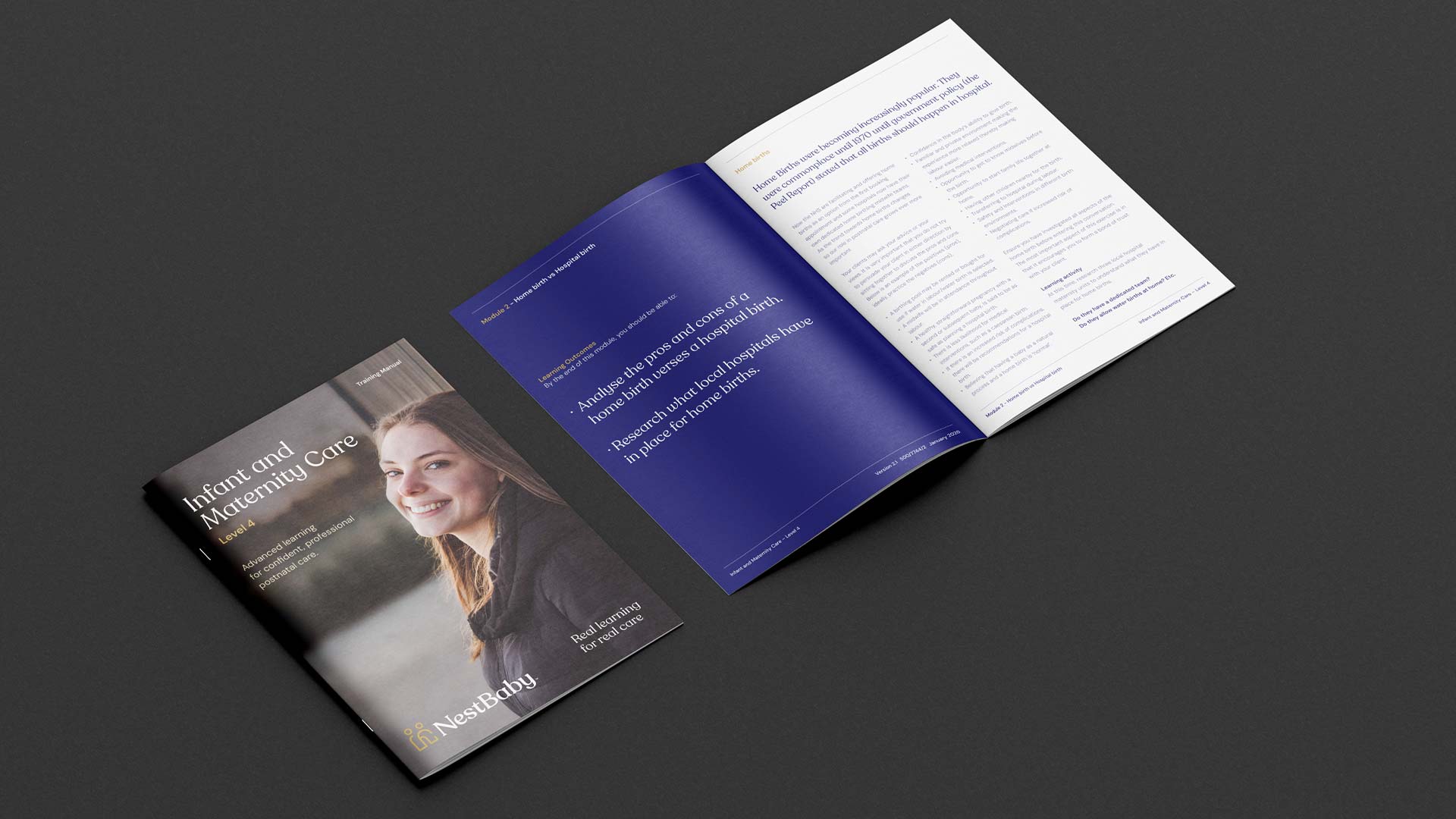
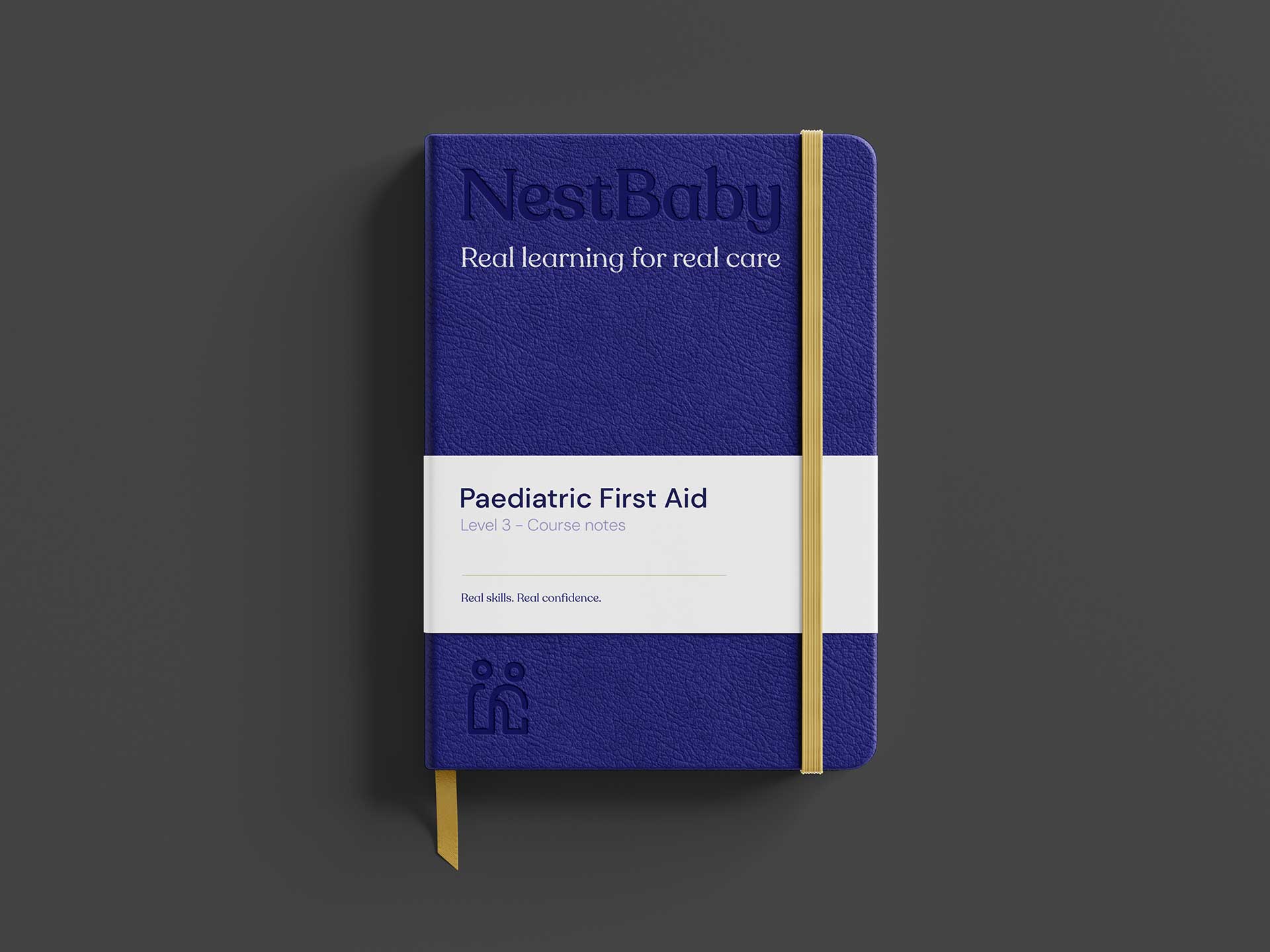
Learning platform (LMS)
Structured, self-paced education built for real lives — not academic environments


NestBaby doesn’t just deliver courses. It supports people learning how to care.
That shows up in how the platform works:
• Clear, structured modules
• Self-paced learning designed around real life
• Practical, real-world scenarios
• Support without overwhelm
Everything is built to move learners from:
Uncertain → confident
Curious → capable
Most platforms focus on completion.
NestBaby focuses on understanding.
Most teach information.
NestBaby builds confidence in real situations.
Most feel transactional.
NestBaby feels human.
NestBaby now stands apart.
Not as another education provider — but as a brand built around care, trust, and real-world learning.
- Clear positioning.
- Consistent communication.
- A defined learner experience.
A system designed to connect, guide, and grow its audience — not just sell to them.
This works because it’s not just branding. It’s a connected system. The positioning, tone, identity and experience all reinforce the same idea — real learning that supports real care.
- Nothing competes.
- Nothing confuses.
It’s clear, human, and built around how people actually learn. That’s what makes it different. This works because it starts in the right place. Not with the business. With the learner.
Every decision — from positioning to platform — is connected by one idea:
• Make learning clear, human, and useful in real life.
• That consistency builds trust.
• And in a space built on care, trust is everything.
By starting with the people it’s for. Most brands default to industry language and end up sounding the same. We focus on the learner, their motivations, their concerns, and how they actually think and speak. That’s what shapes the tone, the messaging, and the experience.
It means designing everything around how people learn, not how businesses sell.
• Clear structure.
• Simple language.
• Real-world relevance.
From the website to the learning platform, every step is built to reduce confusion and build confidence.
Because without it, everything else becomes inconsistent. Positioning gives you a clear idea to build around. It aligns your message, your design, and your experience. When that’s in place, people understand what you do — and why it matters — immediately.
