The development sits close to Glasgow’s busy shopping streets, traffic and competing visual messages.
Its identity needed to be immediately recognisable. But visibility alone was not enough.
215 also needed to appeal to buyers looking for a more considered way of living: connected to the city, with room to step back from it.
The brand had to communicate both qualities without becoming loud, decorative or disconnected from the architecture.
The strongest starting point was the building itself.
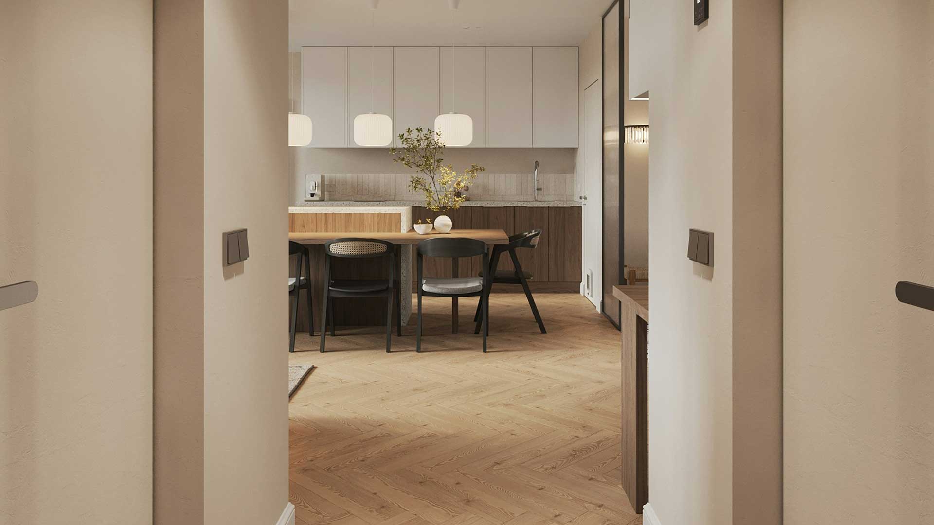
Its repeated structural rhythm offered a visual language based on proportion, form and balance. The proposed homes added another dimension: light, openness and a sense of retreat.
Together, these qualities suggested a clear direction.
An identity could feel bold in its construction and calm in its presentation.
We explored the construction and configuration of the numerals before developing their wider application.
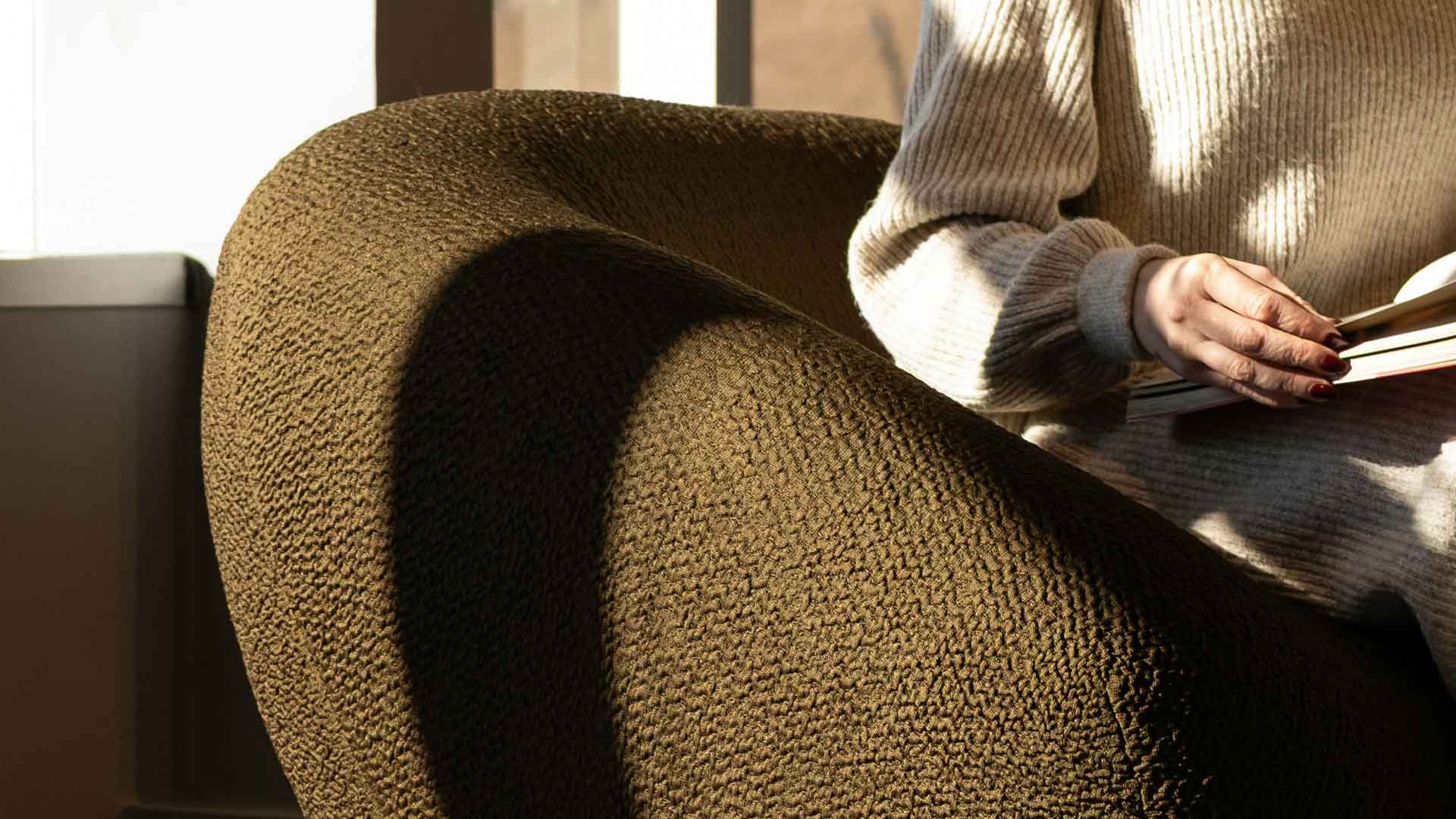
The visual language balanced the precision of the mark with warmth and texture. Deep green and golden fabric imagery gives the cover and site graphics a softer, more domestic character.
Inside the brochure, generous space, restrained typography and muted blue accents organise the content without competing with the interiors.
That balance matters.The identity needs to be noticed, but the homes need room to speak for themselves.

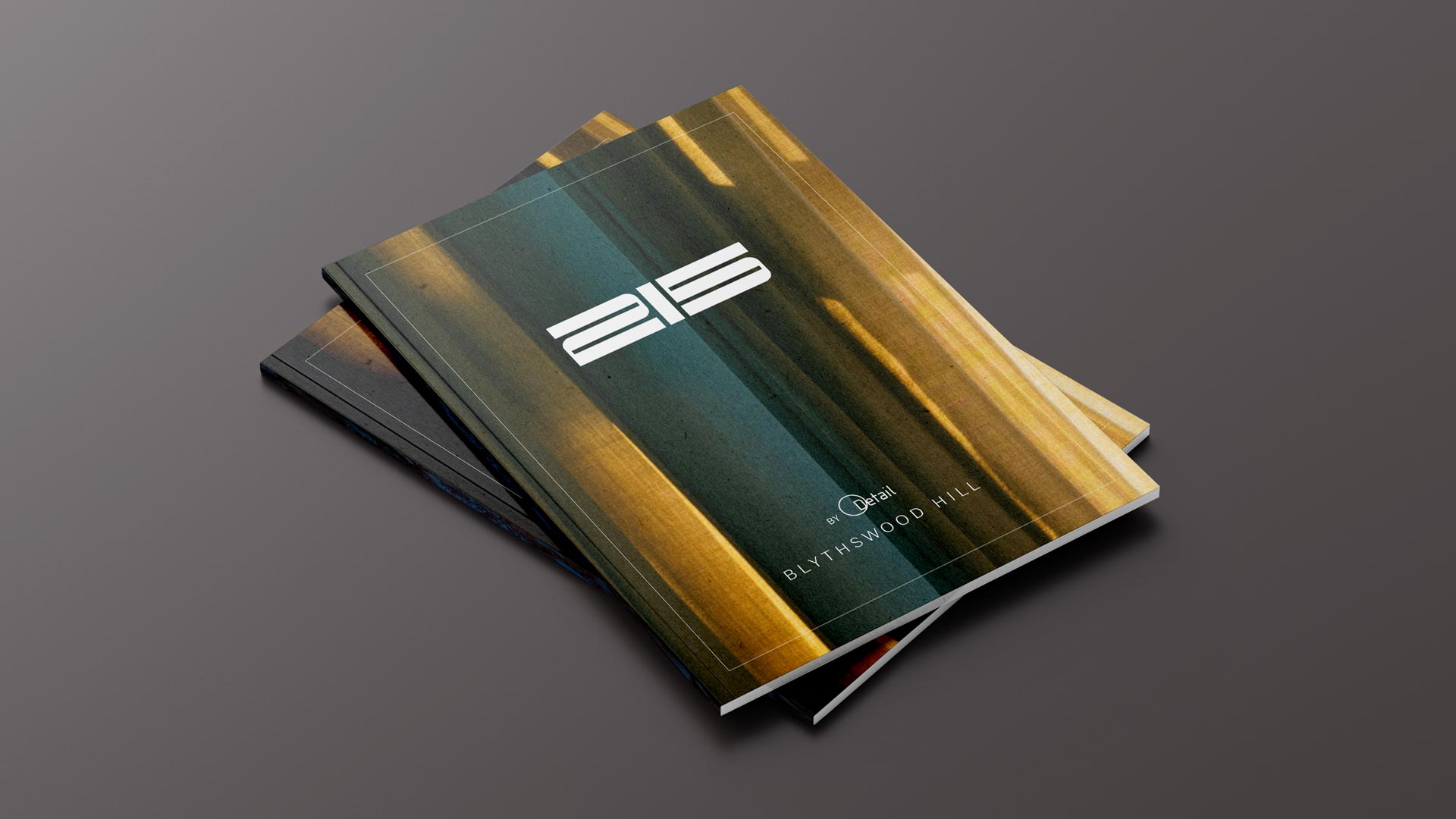

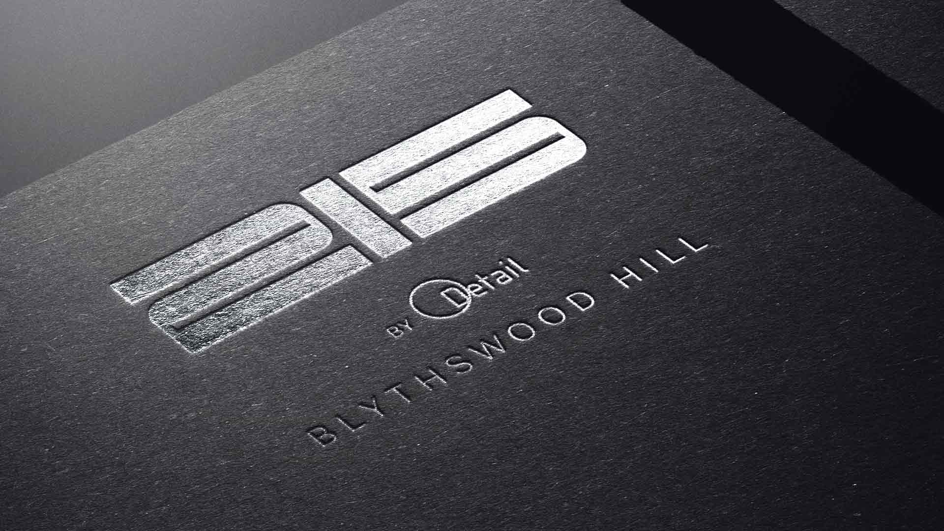
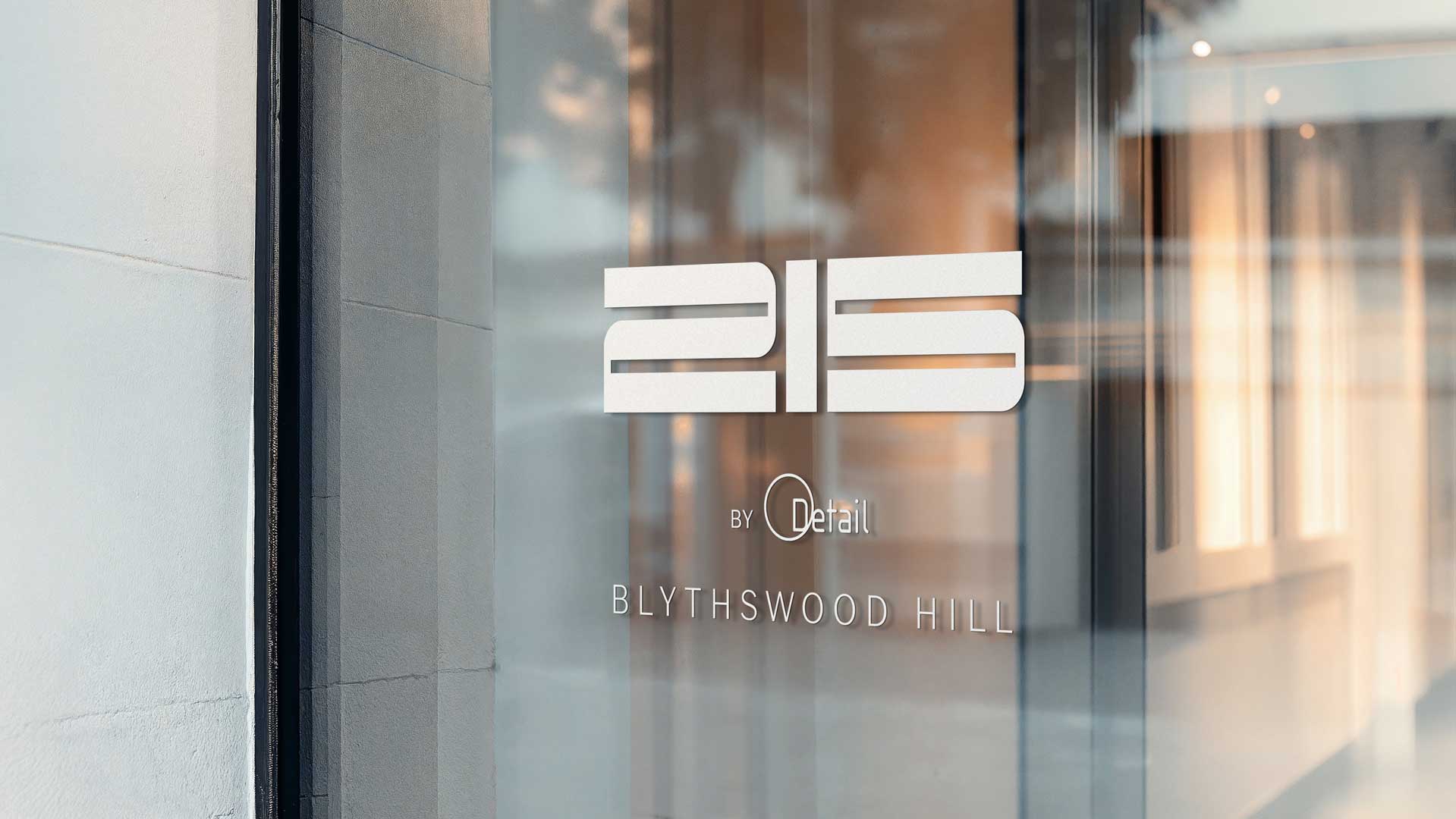
We centred the identity on 215, turning the address into a distinctive graphic signature.
The creative thinking explored how the numerals could share a consistent structure, drawing on the architectural rhythm of the development.
The final mark brings those numbers together in a strong horizontal arrangement. Repeated lines, controlled spacing and simplified forms give it a recognisable character.
“By Detail” establishes the connection to the practice behind the development, while “Blythswood Hill” anchors the identity in its location.
Each element has a clear role: recognition, provenance and place.
A development brand needs to connect the first impression with the experience being offered.
For 215, that meant considering how someone might encounter the project on the street, explore it through a brochure and begin to imagine living there.
The site graphics establish presence. The brochure introduces the setting and the homes. The apartment plans and specifications provide the practical information needed to look more closely.
These are different stages of the same conversation.The identity gives them a consistent visual thread.

The work brought together:
• A distinctive 215 numerical identity.
• A supporting arrangement for “By Detail” and “Blythswood Hill”.
• A coordinated colour, typography and imagery approach.
• A property brochure covering the location, apartments, roof terrace and practice behind the development.
• Clear layouts for floor plans, specifications and apartment information.
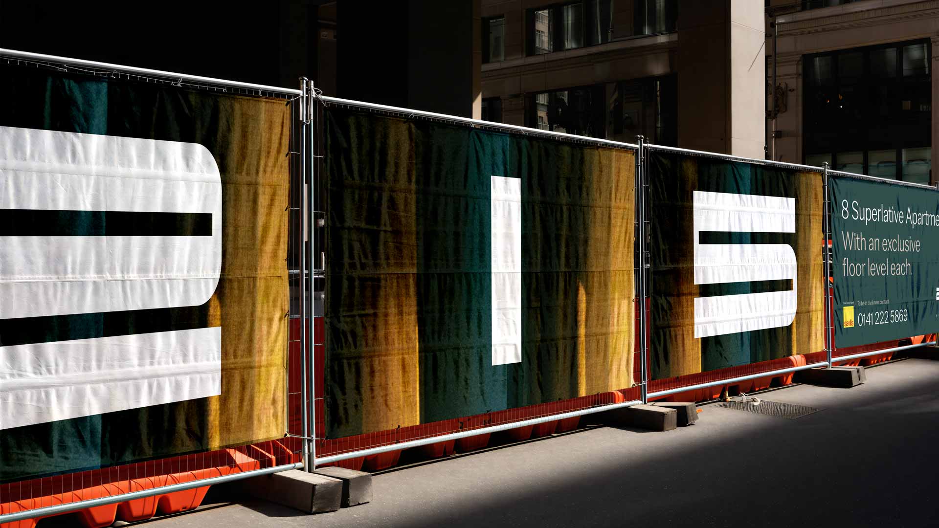
• Large-scale site graphics using the individual numerals across successive panels.
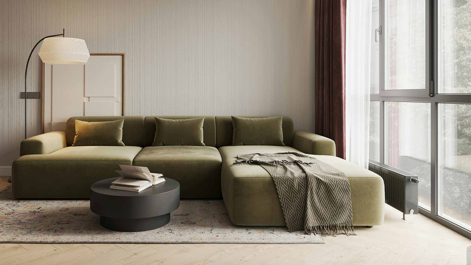
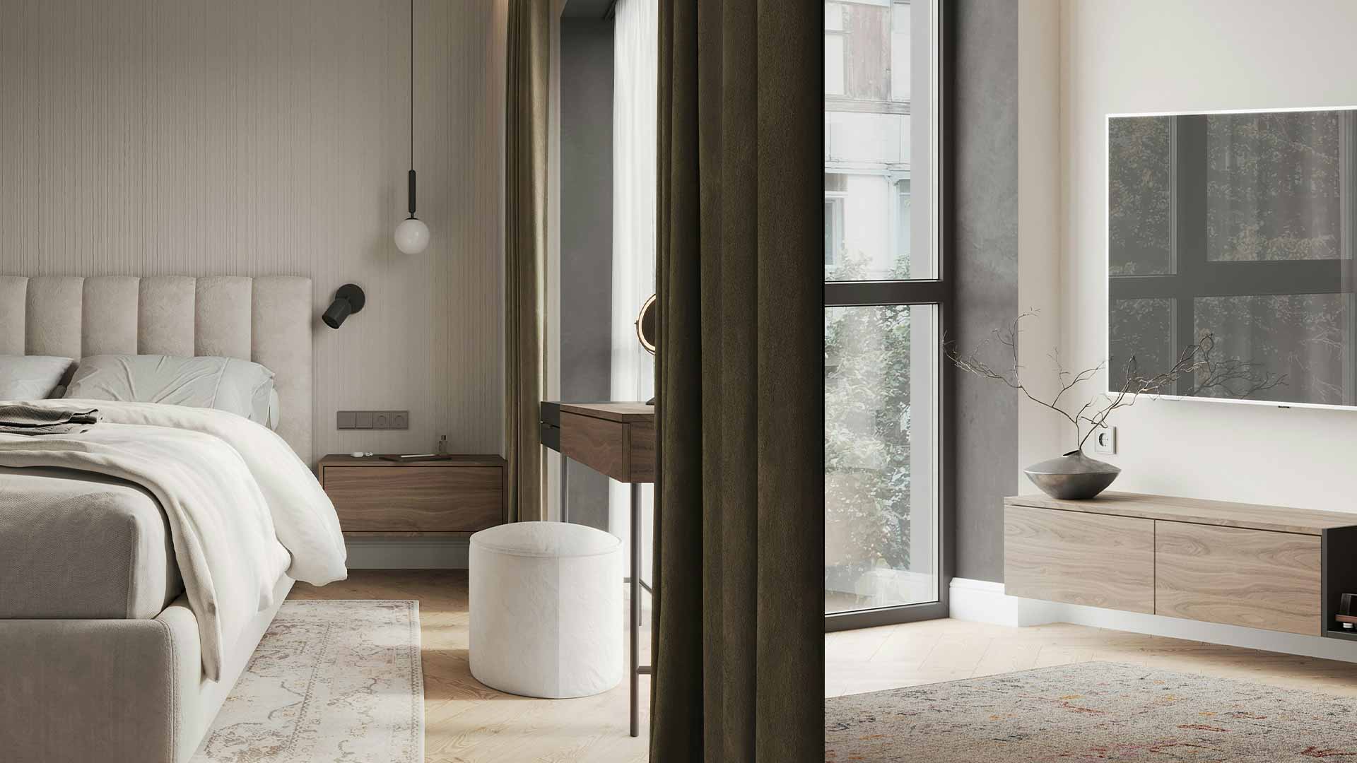
The brochure moves from the wider appeal of the location to the detail of the homes. Interior visualisations establish atmosphere, while the plans and specifications support closer consideration.
At street level, the enlarged numerals create a different expression of the same identity: simple, confident and visible across the site frontage.
215 does not rely on a generic visual shorthand for luxury.Its character comes from the relationship between architecture and everyday living.
The structured mark reflects the building. The material imagery introduces warmth. The brochure combines an emotional introduction with useful information.
This gives the development an identity rooted in what makes it particular, rather than a style that could belong to any address.
215 by Detail gained a connected set of brand and marketing materials, from the development identity to the brochure and site graphics.
The work gives the project a consistent presence and a clear way to introduce its location, design thinking and residential offer.
It also allows 215 to have its own character while keeping the relationship with Detail visible.
The creative direction began with the place and the people it was intended for.
Architectural rhythm informed the identity. The promise of calmer city living shaped the presentation. Practical information gave the brochure substance beyond its imagery.
Every element supports the same idea:
A distinctive address. A considered home. A clear connection to Detail.
A development identity helps buyers recognise a project and understand what makes it different. It connects the location, architecture and proposed way of living across the brochure, site signage and other marketing materials. For 215, the address became the foundation of that identity.
The development should have enough distinction to express its own location and character, while making the relationship with its developer clear. At 215, the numerical identity creates recognition, while “By Detail” identifies the practice behind the project.
A useful brochure balances inspiration with information. It should explain the location and design approach, show the proposed homes, and provide clear floor plans, specifications and enquiry details. Visualisations should be identified as illustrative so buyers can distinguish the proposed design from completed spaces.